
Week 4 | Layout and Logo
- Feb 7, 2022
- 3 min read
Layout
I had figured out how the environment was (roughly) going to look last week, so this week I wanted focus on how the specifics of the layout. Almost all of my previous environment assignments in LASALLE have just happened to be interiors and I never really got the chance to do organic environments. I lacked experience and had to do some research on how to compose organic things.


I loved the charm of Disney's painted backgrounds from the Golden Age and wanted to emulate them for my own background. I looked at the backgrounds from Walt Disney's Fantasia (1940) and Bambi (1942). Many of their subjects in those films were small fairies or animals in the forests, making the scale of the plants close to what I wanted. I noticed that in many of their wide-shots, they framed the subject with large leaves and other flora in the foreground. I decided that I could use that for my own composition as well.
With the spider-web as the focus, I sketched out the composition of the layout I wanted. I also added in some rough values to see how the lighting would look like. I made the the spider-web the brightest as I wanted it to be the focus while the foreground would have the darkest values, to nicely frame everything.

This is what I plan for my establishing shot to look like. I also want to add some parallexing to it as the camera to zoom in, so I will have to plan out my layers well.
Logo
We also started designing our logo this week and I produced a few rough sketches, done both traditionally and digitally. These were the first batch:
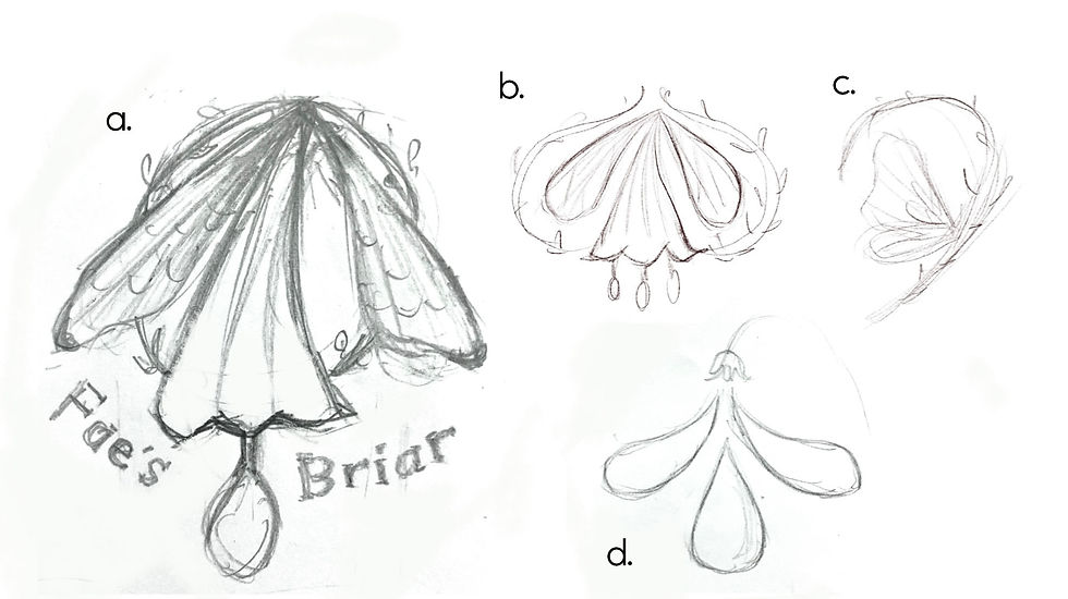
I wanted to incorporate wings (Fae) and thorns (Briar) to represent the brand, but I also wanted to add some elements of the product (Dew) so, for some of the designs, there is a flower secreting dew droplets. However, adding in that many elements turned out to be too overwhelming visually. I really liked a. and b. , as they both had that natural elegance that fairies are often associated with. However, I got feedback from my two lecturers that they were too detailed and would be hard to recognise as a symbol.
But both of my lecturers really like d. .The shapes were simple enough to read easily but still formed an interesting design together. I thought that it was far too minimalistic and modern to fit into a fairy setting though. Thus, I explored different ways I could keep the main silhouette and shape while giving it a some fairy-like embellishments. These were what I came up with:
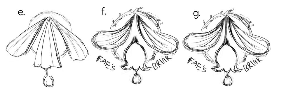
To keep the silhouette in d. , I tried a bell-shaped flower instead so that everything is rounded and there is a harmony among the shapes. I also added a circle of briar around it to make it more structured.
f. and g. is very similar so I had a hard time choosing but I felt that the stem in g. pulled everything together, connecting the elements and making the logo feel more cohesive, instead of looking like separate elements arranged together. g. will probably be my chosen design but I would love to hear your feedback! Which is your favourite design?
Next week..
Hopefully, I will be able to finalise my logo design and clean it up to make it look like a real professional logo. I also plan to start, and if possible finish, both my animatics for the tvc and the logo. Stay tuned!
7 February 2022


the spider-web in the layout sketch looks so delicate. i like.
- sarah wong si en
whaaaaaa i really like a, b and c though! I can kinda see b as an onion from afar so i kinda get it but C has a lot of potential to be simple yet elegant imo??? i think for the further designs, f seems pretty promising. plus i don't think you need the stem as the placements of the shapes can already be assumed to have a stem. they're all pretty though!!! love love , Taqi