
Week 5 | Animatic and Ident
- Feb 14, 2022
- 3 min read
Animatic
It was high time for me to solidify my storyline. I went straight into animatic simply because it was easier and much more efficient for me that way. I have yet to add sound or figure out the narration but the story is all there.
There are definitely some changes to be made here. Most of them are for the shots of the product in action.
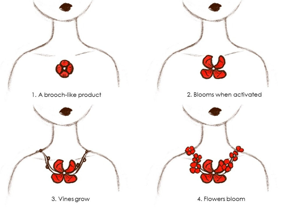
The first change has to do with the fact that I altered the method with which my product worked. In the animatic I drew it's original form as a necklace. However, the necklace chain made the growing of the vines look messy. I think I will probably change the original form of the product to a something like a brooch except it can stick to the skin. This way the growing of the vines will look clearer.
Original (Necklace):


Modified (Brooch):

I also sketch out a rough packaging idea for this new product form:

The second change is to the scene where the fairy breaks the spiderweb with her wings. Instead of having the camera, positioned from the front, I could just continue "filming" it from the same angle.


Change from this angle... To this angle.
I also got feedback that the camera could stay at that back angle as she flies up twirling, escaping from the web. Like so:

Those are the two biggest changes I plan to make to my animatic. I also plan to use the last scene with the wide-shot of the environment to place in my call-to-action. The camera will then zoom out showing the full environment and then pan down where the logo will be revealed. This leads us to...
The Ident
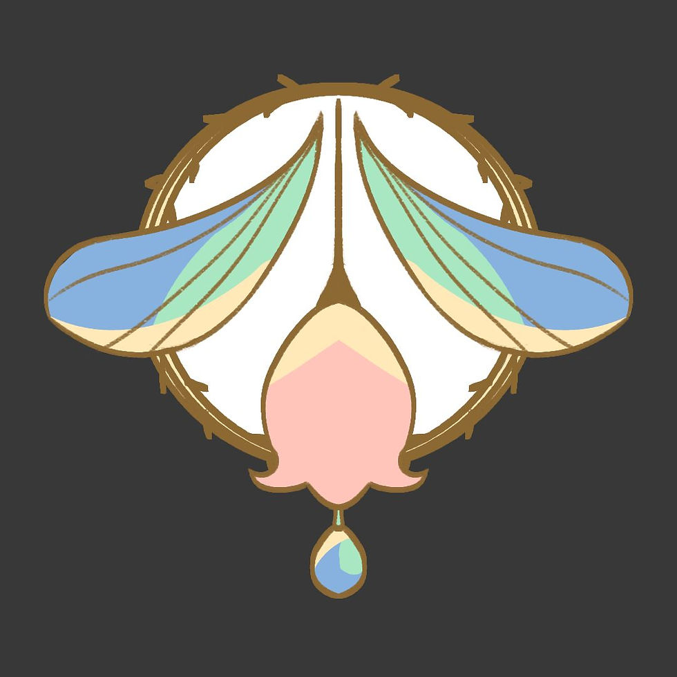
I had chosen g. from my previous week. I tried to use a more "barbie" colour scheme with saturated pink and blues but it ended up looking quite childish.
I did like the way I shaded the wings and dew without blending so I kept that in mind while experimenting some more.
I think the shape itself was bothering me so I redrew the logo but this time, I made the flower rounder, like a bell. I also made the lines thicker and used a golden colour so that it looked like an enamel pin.
I used lighter, more pastel colours with a big majority being off-white, helping keep the harmony. As I changed the canvas ratio from a square to widescreen, I also widened the wings and made the words bigger to fill up the space. I used an art nouveau font as I wanted my brand to emit this natural elegance.

I was much happier with this version and I proceeded to animate the way I wanted my logo to be revealed. At the start, I wanted the wings to flap but I realised that would take too long for me to animate smoothly.
I decided to instead connected it to he background of the last scene from my tvc, having dew drip down from the leaves in the environments before it reaches the logo, revealing it as shown here:
For the animation of the words, I actually wanted it to be similar to the title animation from Tinker Bell (2008) by DisneyToon Studios but it might be overkill since there is already alot of animation at the start. What do you think?

PLEASE HELP
This is probably the part where I need the most help so pleaseee if you don't read the rest at least read this part. I was given feedback that my brand name is hard to understand if the reader doesn't have the context of what Briar means. I was also told that my logo didn't convey the same humorous tone of my TVC.
To rectify this, I was suggested to come up with a witty tagline. Something that could tell us that my brand is for fairy protection while also having the same comedic way of making light of a life and death situation, like in my tvc. I am wrecking my brain but it is so hard to come up with something.
I can only think of basic sentences like "Protecting fairies everywhere" but it doesn't have any wit nor humour to it. My smart friends, please help ;-; I would love to hear the suggestions you have!
But if nothing comes to fruition, I might just forgo having a tagline at all.
Thanks for reading!
14 February 2022


i loved the animatic aiyo... the changes you made were all pretty good and it was nice to see the process behind the changes! and i dont think the tinkerbell animation with your brand name would be overkill so why not try it anyway? hehe
tbh i dont see why your brand has to be witty la, but like the only thing i could think of was "fly easier, fly free" HAHAH
-syafy
Hello Hill!! Was wondering since Briar is another name for roses, maybe you can use the concept of thorns on roses and create a tagline that relates back to the brand name as well? Maybe a pun of sorts? I can't think of anything witty but something alone the lines of "Getting rid of the thorns off your rosy life"?? idk, maybe hshshs
-Taqi
PRODUCTIVE AS ALWAYS !!
Really love your product packing design, very magical and reminds me of a music box from fairy tale stories. I like your idea for the logo design , it's very clear for your target audience that your products are meant for fairies.
The way you animated your product transformation is very exciting and it looks fun to use ~<3
-Karyan
Hi, Hillary! I'm so surprised to see your animatic, and it is fantastic! I can already appreciate the atmosphere of the film and the emotions of the characters! GOOD JOB! The painting of your character is also just so nice! Hmmm, the tagline, how about 'Don't underestimate the fairies'?
From Seoyean
BRO FOR UR IDENT WHEN UR MUSIC AND THE FLOWER ANIMATION MATCH TGT I WET MYSELF EH SO SATISFYING
ideas for tagline:
Stay fly like the queen you are
Slay, don’t get slayed
Fairies can be strong too
I think of more then I msg u